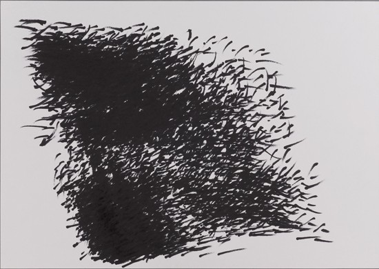
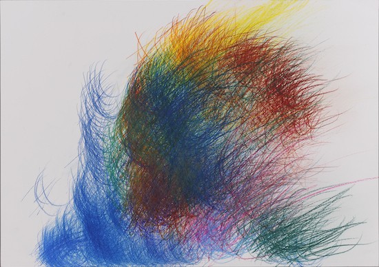
 Yuichi Saito – Detective Konan (c 2005) pen on paper, 39.8 x 54.8 cm, private collection.
Held at the National Art Center, Tokyo, the 42nd Japan Fine Arts Exhibition (Nitten) ran from late October to the beginning of December 2010, and is now touring nationwide. Despite being Japan’s largest art exhibition, with 175,000 visitors in Tokyo alone and capable of totaling over 500,000 (source: 41st Nitten) when the throngs packing-in to view an incredible 3,000-plus works at regional venues are included, this is one mega-art event that remains steadfastly ignored by the contemporary art media.
Nitten consists of works entered in an open competition by artists from around the country, and works by artists permitted to exhibit without screening. There are five genres: Japanese-style Painting, Western-style Painting, Sculpture, Craft as Art, and Calligraphy. Entries for the open competition break down as follows:
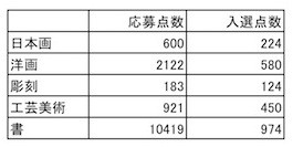 From top to bottom, this chart taken from the official Nitten website lists numbers of entries and works selected in the five genres, Japanese-style Painting, Western-style Painting, Sculpture, Craft as Art and Calligraphy, with entries represented in the left-hand-side column and number of selections in the right-hand-side column.
Now I expect most readers would be surprised to find that by far the greatest number of entries is for the calligraphy section – beating painting, sculpture and crafts hands down. Granted, the works in question may be small, but that calligraphy should occupy such a prominent position in the “arts sector” is a dose of the real Japan that will come as a shock to those who usually restrict their art-viewing to contemporary art exhibitions.
Historically, calligraphy evolved as an attainment elementary to cultured individuals, and apparently only acquired the status of “art” in the period starting in the early Showa years (ie, from 1925) and continuing to after World War II. And as many are no doubt aware, just as there is contemporary art that is incomprehensible without recourse to an accompanying expository text, there is also contemporary/avant-garde calligraphy that is unreadable without a title. Calligraphy as fine art, calligraphy as form that cannot be read even though it consists of written characters, is “calligraphic art” as abstraction.
At the opposite extreme – yet oddly close to calligraphic art, which at its own extreme takes the means of communication of writing text and ghettoizes it in the arts by rendering it illegible – is “outsider calligraphy.” I’ve given works in the outsider art category consisting of text rather than pictures this title simply for the sake of convenience, where in fact there is no real distinction between artist and calligrapher. Yet the character-focused works produced by so-called “disabled” individuals possess creative tension on a par with any professional “calligraphic artist,” plus a powerful writing impulse, and a mysterious beauty. As such they force us to consider the raison d’etre of calligraphy in contemporary art.
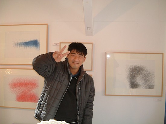 Artist Yuichi Saito.
Yuichi Saito is an artist working at the Kobo-Syu studio and workshop for the disabled in Kawaguchi, Saitama. Born in 1983, he is an outsider artist to watch, having at just 27 years of age already taken part in numerous shows in Japan and beyond.
Saito joined Kobo-Syu in 2002. According to staff member Ko Umeda, who has looked after Mr Saito and monitored his progress from the beginning, “When he first started coming he couldn’t settle and would be constantly on the move, unable to sit still for even a minute. Work of any sort was out of the question; in painting it was all he could do to complete five simple circles or squares in a day; in weaving he couldn’t understand the process, and just kept repeating the same movement over and over.”
This was until a chance encounter with calligraphy, when “everyone joined in writing the character ‘shu’ [meaning to assemble, or congregate] to make a sign for the workshop.” Up to then utterly incapable of concentrating, when it came to text Saito suddenly was sitting still for long periods, rocking and humming the occasional tune while taking pleasure in writing.
Initially with Umeda sitting alongside, he used brush and ink to carefully copy individual characters, the standard way to learn calligraphy. However, says Umeda, “If I went away for a moment, I’d come back to find he’d written again and again on top of the character on the same paper, until it was completely blacked out.” Ultimately Umeda decided to let Mr Saito write however and as much as he wanted.
 Yuichi Saito – top: Hamidashi Keiji (2005), pen on paper, 39.6 x 54.8 cm, private collection; bottom: Doraemon (2005), colored pencil on paper, 39.6 x 54.8 cm, private collection.
What he writes are the titles of his favorite TV programs: cop shows like Hamidashi Keiji and Hagure Keiji, plus Detective Konan, Doraemon, Pocket Monsters, TV Champion, etc. He writes the names of the programs he likes over and over on the days they air, before they air. And as he takes just one part of the title, for example the phonetic character “a” from TV Champion, or the Chinese character for “hami” from Hamidashi Keiji, and writes it repeatedly, it forms a strangely attractive mass of text – something that looks legible but isn’t, or that appears to be just a mass of color, but on closer inspection consists entirely of characters. His work could well be an incarnation of the writing/drawing impulse itself, hovering on the border between art and calligraphy.
Another artist worth considering is Kunizo Matsumoto of Osaka. Born in 1962, Matsumoto helps his parents run a Chinese restaurant at the foot of the Tsutenkaku Tower, and since 1995 has attended Atelier Hiko, a Hirano painting workshop for the disabled.
Though he graduated from the high school division of the special needs school attached to Osaka Kyoiku University, Mr Matsumoto has never learned writing, either at school or at home. He was switched on to the act of writing on an outing with his kabuki-loving grandfather to see a performance at the Umeda Koma theater. So riveted was he that the rice cracker he was given before the curtain rose stayed firmly clenched in his hand, crumbling into pieces by the end of the performance, he says. Matsumoto was just three years old at the time.
From that day onward he became an avid kabuki fan, and remains so, but at some stage he began to take official kabuki programs, plus material such as the Disneyland guidebook, travel pamphlets and so on, and study them endlessly before assiduously copying onto calendar pages, scraps of fabric, notebooks or whatever surface was on hand any characters that took his fancy.
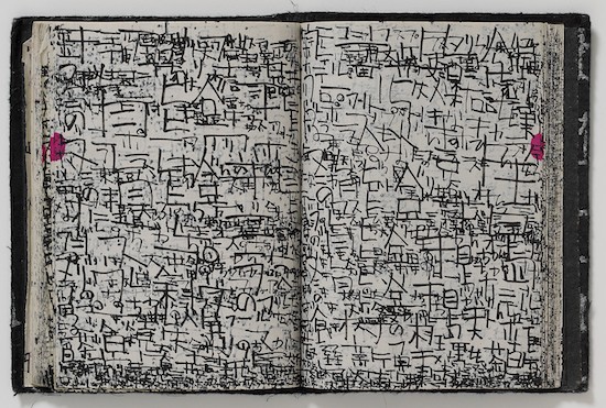 Kunizo Matsumoto – Untitled (2002), pen on notebook paper, 155 x 230 cm.
Matsumoto, who has never actually been trained to read, might for example watch a kabuki performance, look at the program, and “read” and then “write” characters not based on intellect but by a kind of physical intuition, a sense that “this character suits this performance.” And the mysterious, exciting thing about this process is that we who view the result can actually “read” it.
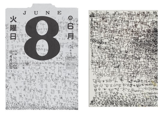 Kunizo Matsumoto – left: June 8 (2004) pen on calendar paper, 38.2 x 25.4cm, private collection; right: Untitled (2004-05), pen on memo paper, 15 x 11.6 cm, private collection.
In contrast to the work of Yuichi Saito, Kunizo Matsumoto almost exclusively writes kanji Chinese characters. But aren’t kanji a device for expressing things in symbols – that is, ideographs (hyoi-moji)? Surely the process of divining the meaning of kanji simply by gazing at them intently, transforming this into one’s own original expression and fixing it once again in two dimensions could be described as an extraordinarily radical, that is to say, fundamental act of “calligraphy”? Perhaps what Mr Matsumoto – a man who has never even been taught to write, let alone received any sort of calligraphy education – shows us is another sort of hyoi-moji: a passion “possessed” (hyoi) by characters.
It strikes me that just as superior outsider art has the potential to skewer professional pretensions in the “contemporary art sector,” superior outsider calligraphy constitutes an assault on the all too well-trodden path of “calligraphy.”
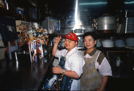 Osaka – at the base of the Tsutenkaku Tower. Kuni-chan, as he is affectionately known, takes his time to get going in the morning. Waking before 6am to fetch the paper, after reading it thoroughly in the kitchen with a coffee he returns to his room and goes back to sleep.
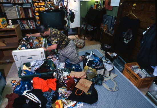
 Arising again in the early afternoon, he gets ready and heads off to Atelier Hiko in Hirano, accompanied by his teacher, who has come to collect him. On returning home in the evening he starts preparing to help out in his parents’ restaurant. This he begins by moving all the stuffed toys crammed into his cupboard into big plastic bags. Packing dozens of toys into two bags, he adds any magazines, newspaper ads, pamphlets of interest, etc, then changes into his work gear, chooses a baseball cap to suit his mood, pulls it firmly onto his head, and finally goes to work.
Proceeding downstairs to the kitchen he takes the stuffed toys out of the bags and arranges them on top of and around a TV sitting next to the sink, speaking to each one as he does so, ultimately creating a little corner reminiscent of a colorful altar. All this takes around an hour. Only after completing these preparations does he start washing dishes, but having taken so long to prepare, apparently he only has time to actually clean a few before the restaurant closes.
After closing he eats dinner while perusing the evening paper. His favorite accompaniment to a meal is a glass of draft beer, split with juice.
All images courtesy of Yukiko Koide Presents.